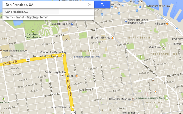
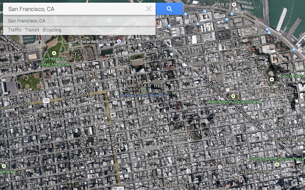
‘This is San Francisco:’

‘No, this is San Francisco–‘

‘No. This is San Francisco.’
One mark of great cities is verticality, a tangible z-axis. Rome was built on seven hills, Athens grew in the shadow of one big eff-off one. Great cathedrals set humans and human-sized dwellings in their medieval place; skyscrapers emulate them with new models of aspiration. The arteries of Edinburgh’s Old Town are criss-crossed with steep, narrow alleys and curved descents that wrap level upon level; the terraces of Newcastle’s Grey Street funnel you down into a paved delta of streets and passageways and staircases that meet the banks of the Tyne, while granite and girders span the river from high above.
Maps set preconceptions and reinforce misconceptions: these can be challenged by better maps, but perhaps are only unlearned through direct experience of the spaces they portray. Someone who visits San Francisco as more than a tourist will learn the true extent of the city west of Divisadero, and a frequent traveller in London will eventually overlay the Tube map with a personalised A-Z and a set of shortcuts, but the equatorial compression of Mercator (perpetuated in most online maps) is harder to dispel for those of us who live above the tropics.
In Europe and North America, we’ve had nearly twenty years’ exposure to online mapping; over the last decade, it’s moved into our pockets, and that familiarity impresses upon us a rendering of the world — usually courtesy of Google, and if not, heavily influenced by its example — that reflects a set of design choices, and projects a set of priorities.
These are now your defaults: the abstract pastel-hued plane of the road atlas, or the foreshortened overhead view of the satellite.[1] Terrain becomes a distraction, retained mainly to ornament empty spaces: after all, cars are very good at ironing out gradients.
What other options are provided to us? Scott Forstall’s last hoorah with Apple was the demo-friendly flyover mode, emulating the lifestyle of São Paulo’s rich high-rise dwellers who commute and socialise by helicopter taxi because they’ve given up on the streets. (Verticality works both ways.) Even at ground-level, there are subtle distortions: Google Street View is actually Google Road View, a drive-by snapshot from places where no observers could stand without risking their lives, and in which pedestrian-only public spaces are usually off-limits. Despite all of his iconic sprightliness, Mr Pegman sits in the passenger seat.
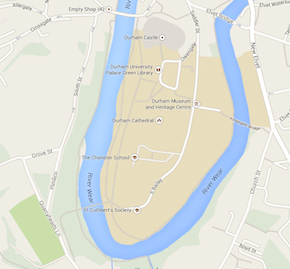
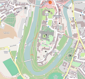
One more example: the historic heart of the city of Durham (the one in the north of England, not North Carolina) is perched atop a hill and wrapped in a loop of the River Wear. On the Google Maps default view, it’s flat and empty; the OpenStreetMap version is far busier, perhaps even cluttered, but at least it gives a sense of how the castle and cathedral anchor the place.[2]


::
I still remember my first geography lesson from nearly 30 years ago, marking contours from the Ordnance Survey 1:25,000 maps onto strips of paper and using them to trace profiles of the landscape. It wasn’t long before I could skip that step and read those lines to conjure up the shape of hills and valleys or the elevation of cities.
In online maps, topography largely steps back in favour of a survey that glides smoothly over the land and parses it first, second and third in terms of route-planning and passing-through. It’s a shift of emphasis as radical as John Ogilby’s linear portrayal of the main roads of England and Wales in 1675, which ‘marked the transition from route, a direction of travel between known points, to road, a physical feature in the landscape’ and asserted a vision of the nation as a coherent and connected economic entity. Perhaps Google’s cartography really is the gradual creation of a navigation system for its driverless cars; perhaps it reflects the low-rise, low-density car-centric landscape in which it is currently created.[3] Perhaps it’s simply that most commercial online maps are built for limited purpose just as much as the Tube map or the A-Z or the dashboard GPS, and our fault that their ubiquity makes it easy to forget those limitations.
Why does this matter? There’s the sentimental view that the metonymy of mapmaking, for all that it inevitably leaves out, has always confronted the challenge of verticality, both in dense urban environments and sparsely-populated spaces. (The United States, perhaps uniquely, binds part of its myth of origin to mountain-climbing cartographers.) If we grow too accustomed to maps that flatten the earth, whether to simplify our long journeys or because that is how we appear to the orbiting eye, we run the risk of treating the z-axis as mere decoration in those places where it is most present and potent.
[2] Bing is even weirder, collapsing the Wear’s meander to a pixel-thin blue line.
[3] ‘Growing up, directions were simple—in my hometown of Lawrence, Kansas, the roads conveniently run north to south and east to west (and there’s only one hill to block the view). For more than a decade, my team and I have been working to make it just as easy for you to see the world and get where you’re going.’ — Google Maps VP Bryan McClendon, in an email on March 3rd announcing that the new map UI is officially out of beta.